Too Good To Go mobile app Redesign-UX/UI Case study
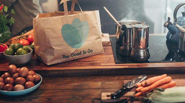

Too good to go is an application against food waste that is governed by ethical and sustainable values. It was born in Denmark in 2016 with a goal to combat food waste. Today they are present in 14 countries and a team of 600 people are working.
It’s Mission is to inspire and empower each person to take action against food waste.


Every year millions of tonnes of food are wasted in European households and it aims to inspire households to take action against food waste.

In restaurants, Patisseries, Supermarkets and Hotels… Too Good To Go collaborates with many new partners in the future and therefore keep track of how many active stores are currently using our application in the fight against waste of food.

It´s objective is to inspire the new generations by creating web content for children from the youngest to university students, through games and other resources. They also add a university section in which they emphasize the number of projects that are created on Too Good To Go, adding a specific list of topics that would be interesting for the contribution of a student.
Its objective is to drive change to transform current practices and move closer to a more sustainable food system. They create initiatives that they send to different countries until they are implemented. They have a current 2020 goal that their initiatives reach the political agenda of at least 5 countries, of which they have completed 80%.
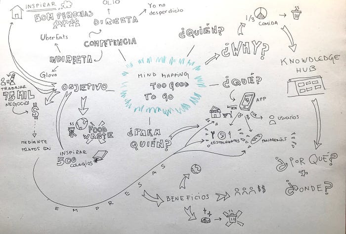
After we studied the application, we learned about its history, its mission, its objective and its competences… we decided to make a mind map to put ourselves in the situation.
Benchmarking
Direct
When analyzing this app, we have discovered that although the purpose is the same, the functionality and strategy of the app is totally different. In it, as a positive point, we find that you can choose the product by gender, and being specific, in which the seller would not be a business, but another user of the app. In it, you also have to go pick it up, however, in food matters it is not a widely used app in Spanish territory. In addition, for hygienic reasons, that a food product has been used before by an unknown person, we do not believe that it has the same confidence as Too good to go, being food treated only by qualified professionals.
In this case, the user is allowed to sell and buy. However, there is not much of a market, and like OLIO it is not very hygienic, so most of its customers (there are 2 active ones), their products expire. Also, in our opinion, it is not visually attractive to the consumer.
Too Good to go in 2019 acquired WeSAVEeat from its largest direct competition in Spain with the aim of consolidating its growth and leadership in the Spanish market and intensifying the movement to combat food waste in the world. With this we come to the conclusion that To Good to go right now is the company that has more potential and is the most widespread that reaches many more users than the other 2 that we have seen.
Indirect

Food delivery companies like Glovo and Uber eats. They don’t have the ethical factor, but they do have the feeling of saving, since they use offers many times, and they have as pros that you can choose the food and they do not have to deal with the cliché of “old food”.
Related trends


Too good to go helps to improve the environment as well as many companies are concerned about their environmental footprint, of which they work together and collaborate such as Carrefour, Alcampo, Danone, masymas …
The Carrefour Group maintains a firm commitment to sustainable development. As a result of this commitment, in 2001 it joined the United Nations Global Compact and compliance with its environmental and social principles is part of its performance and culture.
Both Carrrefour and Alcampo offer fresh food based on a totally natural and ecological production process. If you value the shift towards sustainable and responsible consumption, one of the main issues to have in eco food and articles is labeling. They must meet the requirements established by the European Regulation on organic products; which ranges from the process to certain conditions of handling and packaging thereof.

Our experience
It’s an app that for my use as a user is original, it is a new idea marked by a powerful ethical factor. I find it to be an easy-to-use app, with a fun and easy-to-read dialogue. It has very relaxed colors that bring a little closer to the “Eco” feeling that the brand transmits. It’s all very “handmade”, which makes you feel a little more inside this world that they have created in the form of an app.
At first, I was struck by the fact that you can log in with apple, and then they ask you if you want to hide your email. Maybe it’s silly, but I don’t remember many websites or apps asking me that.
As soon as I enter I find a most original watermelon-shaped globe. This already keeps you going to learn more. In addition, when you click continue, they thank you and tell you exactly the number of users who have registered in the app.
Discover
Upon entering, they ask you for the kilometers you want to search, using a map screen that you adjust with two fingers to increase and place where you are most interested.
Once inside, I get a little lost. I start to see “To eat” and another option “to pick up tomorrow”, and then go down and see a kind of advertisement where they say the food they have saved in the month. Then we find “Bakery”, then another ad from a charity, to continue with “bakery”, “nearby”, for “dinner”, “food”, to end in “favorites, which is customizable. I do not consider that the organization within of the Discover screen is very organic. It doesn’t make much sense that the first option is “for lunch” and then we move on to things like “for dinner” when I am viewing the app at 10:11 pm, so it would not have This order makes a lot of sense. In addition, I consider that the “Food” section should go separately, since it is totally different to want to eat something already prepared than to pick up food at the supermarket. I think they are different needs.
Explorer
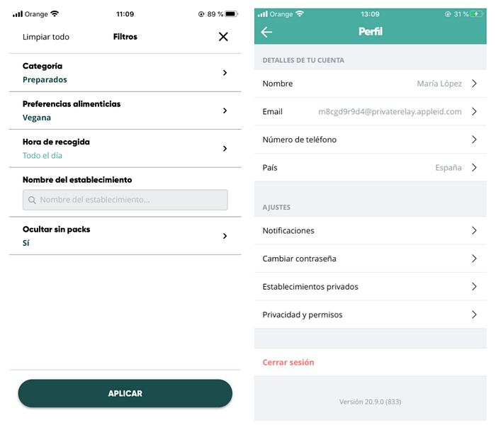
Here we find the filter option, in which we can choose our preferences. Otherwise it has no more difference from the previous screen.
More
In this section we find the part of the Profile, Orders, payment methods, blog, terms and conditions and Help.
In conclusion, I find that the idea is very good for its ethical contribution, for the number of surprises for the user, since it is not a classic app to use, and for mixing that part of the sensation of savings and entertainment.
As weaknesses, I see that they have to fight the cliché that people do not want to eat food that is going to go bad. You can’t eat on site either, so the safest thing is that you only pick up from places that are 10 minutes from your home at most, since there is no delivery.
Finally, although at first I saw it as a positive point, I do not like that there are only surprise packs. Mainly because you don’t let the consumer who picks up their order from a bakery choose between bread or buns, for example. It leaves you very little choice, and one day to try it I see it as “funny” but I would not buy something every day that I do not know if it is going to be healthy or ultra processed.
In short, I see a bigger problem in the “research” than in the visual design of the application.
Improvement proposal
In our opinion, the app could improve by mainly changing the food categories. If instead of giving so many options it were organized in two buttons on the main screen between “ready” and “feed” I think it would be more intuitive.
On the other hand, I have changed the choice icons below, adding a “home” instead of “discover”, and changing the “explore” to a “search”, since these two options seem too similar to me.
In exploring I have added some icons representing the type of food you want, so that visually and at first glance you can find what you are looking for.
Regarding surprise packs, there remains the uncertainty of what type of product the user will receive. We wanted to improve that part by adding more types of packs to choose from.
These packs would be of greater economic value due to the time required by companies to separate between the different types of products.
We would like to divide them into: lactose-free, gluten-free, vegan, vegetarian, nut-free, and sugar-free. This would give the user more play to use the application on a daily basis, and put it ahead of other apps of indirect competition.

In the profile we have added the importance of having a more personalized and friendly icon, and the importance of the user’s achievements, so that they cause a greater impact and adherence to the application.

Thanks for reading!
Click in the clap and if you like leave your comment ;)
